At BATATA HOUSE™, we believe packaging is more than just a container—it’s the first touchpoint of a brand's philosophy, an immersive experience that speaks before words do. For Skin Revolution, we crafted a design that embodies the essence of modern skincare: minimal yet striking, sophisticated yet accessible.
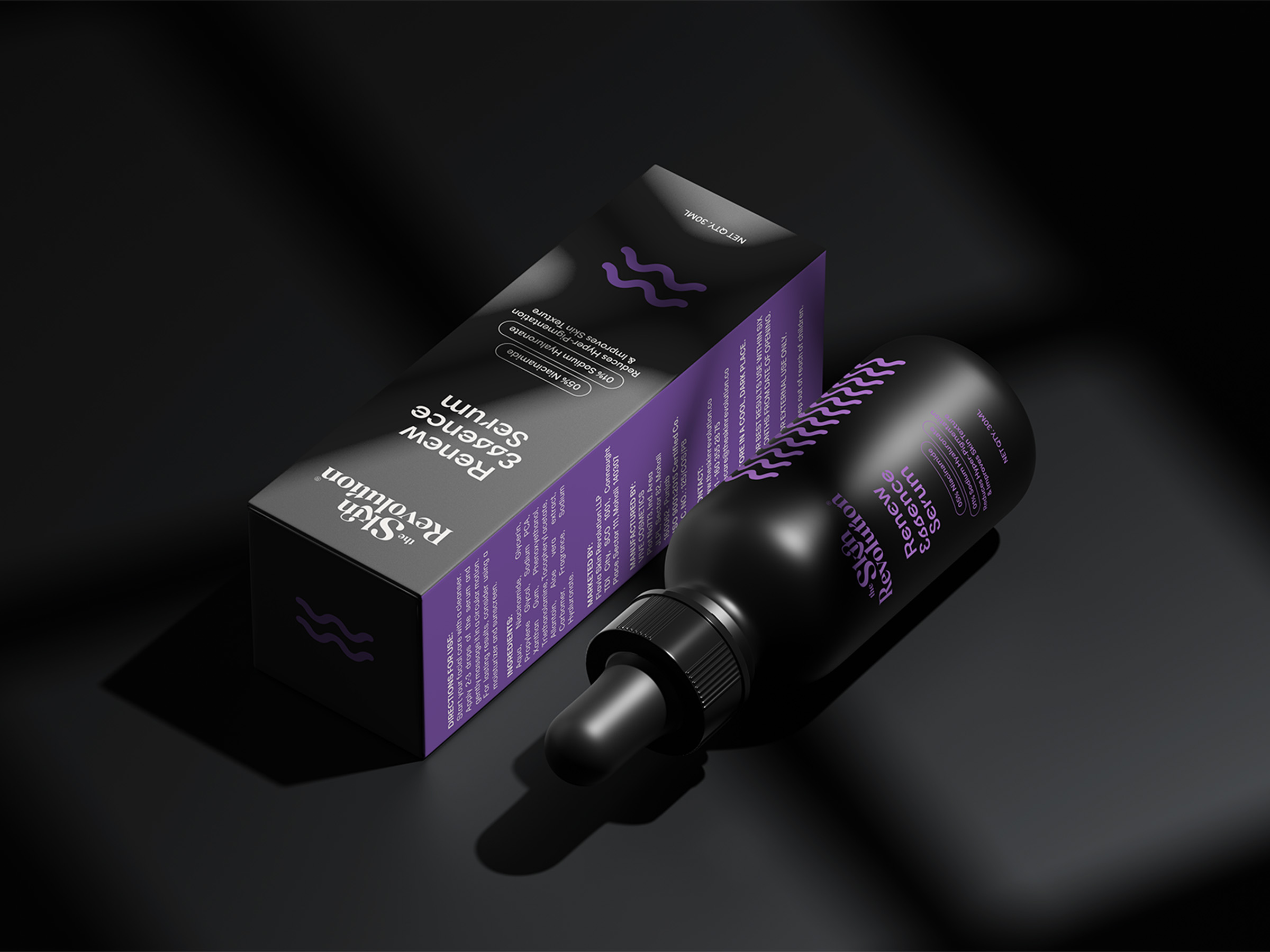
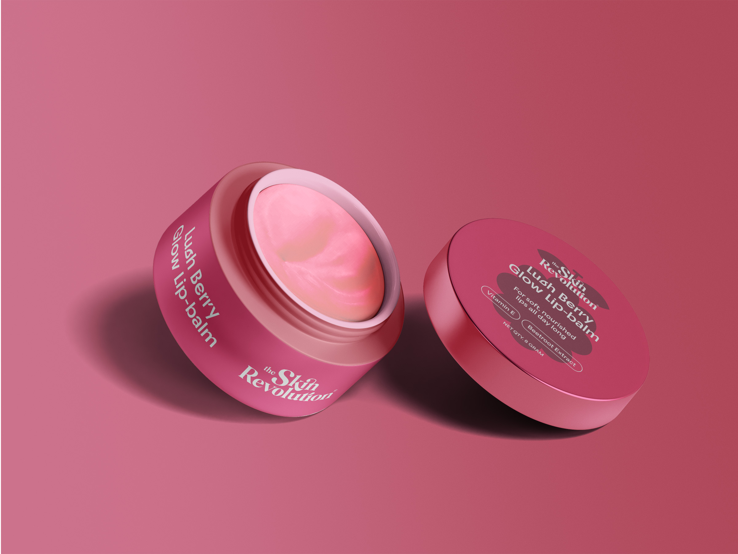
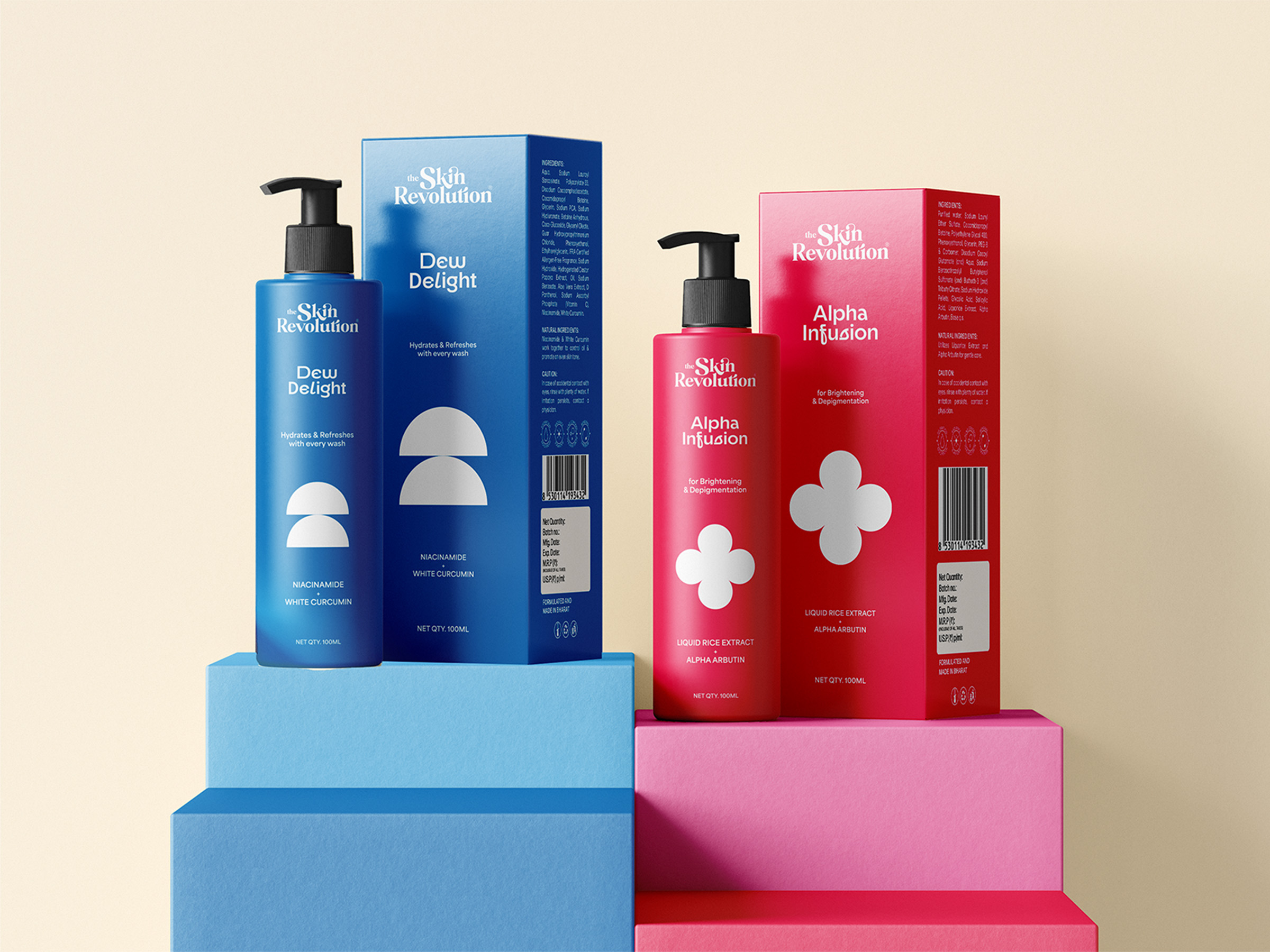
Our approach revolved around three core principles: clarity, elegance, and innovation. The packaging features a clean, structured layout with a balanced interplay of negative space and bold typography, ensuring a premium yet inviting aesthetic. The color palette—subtle yet confident—echoes the purity of skincare while exuding a contemporary appeal that resonates with the modern consumer.
Typography plays a vital role in Skin Revolution’s brand language. A seamless blend of sharp, refined letterforms and soft, organic curves mirrors the duality of science and nature—a revolution in skincare that harmonizes clinical efficacy with holistic nourishment.
Material selection was equally intentional. Every detail, from the matte textures to the tactile finishes, has been designed to elevate the unboxing experience, reinforcing the brand’s commitment to quality and sustainability. The interplay of soft pastels and bold contrasts creates a visual hierarchy that guides the consumer while enhancing shelf presence.
Through our design, Skin Revolution stands as a testament to the power of thoughtful branding—where every curve, every color, and every material choice tells a story of transformation, empowerment, and self-care.
This is more than packaging. This is a revolution.